
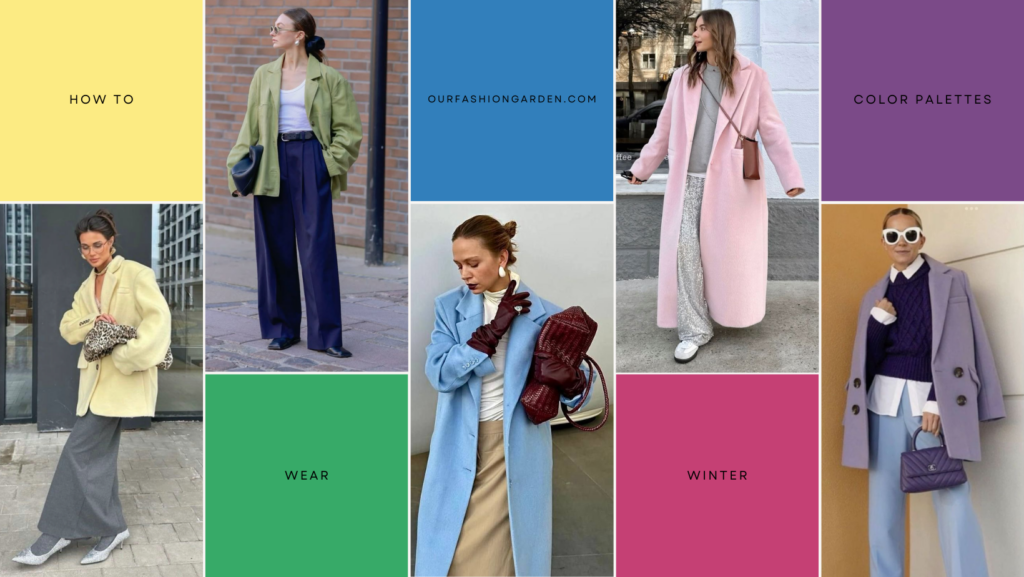
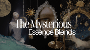
Winter color palettes are known for being the coolest and highest-contrast in seasonal color analysis. If you love crisp black and white, bold contrast, and deep, saturated shades, this palette can feel like home.
For women drawn to a darker aesthetic, the Winter Palettes are especially friendly: black almost always works, along with cool browns, charcoal gray, deep purples, and rich jewel tones. But what happens beyond the usual jewel-tone conversation? What if you don’t enjoy wearing black, or struggle to find true, pure white pieces that feel wearable?
If your style is more classic and you’re looking for the best Winter neutrals beyond black and white, or if you love color but aren’t sure which yellows, oranges, or greens truly belong in your Winter palette, this guide is here to simplify things.
Here, we’ll break down the most flattering neutrals and vibrant colors within each Winter subtype (Dark, True, and Bright) so you can see just how versatile this palette really is. Because being a Winter doesn’t mean dressing only in black and white.
If you’ve ever felt this dilemma in your daily wardrobe, you’ve come to the right place.
When we think of Winter palettes, the image that usually comes to mind is very specific: stark black and white, sharp contrast, and intense jewel tones like emerald, sapphire, or ruby. These colors are striking and clearly elegant, but they can also start to feel limiting, especially if you’re craving variety or a softer approach to dressing.
Many Winters run into the same frustration. Black feels too harsh for everyday wear. Pure white is hard to find, or hard to style. Jewel tones are beautiful, but sometimes too much for casual outfits, workwear, or a more relaxed personal style. And when it comes to neutrals or lighter, happier colors, the question is always the same: What else can I wear without looking washed out or off?
Because yes, Winter is a high-contrast palette, but that doesn’t mean it has to be severe, dark, or dramatic all the time. There’s a whole spectrum of cool neutrals, icy lights, and vibrant hues within Winter that often get overlooked simply because they’re not as “iconic” as black or jewel tones.
A deeper understanding of your winter color palette opens the door to outfits that, in addition to being dazzling, can be fun and versatile, depending on your style.
So let’s move beyond the usual black-and-white formula and start exploring.
And if you still don’t know your Seasonal Color Palette, you can book a Personalized Color Analysis with us!
Dark Winter
In most cases, people with a winter color palette look best in black, especially those with a dark winter palette. So it’s no surprise that when you think of dark winter, black is the first thing that comes to mind. And while it’s certainly versatile, not everyone likes it, or simply doesn’t want to wear it as an everyday staple.
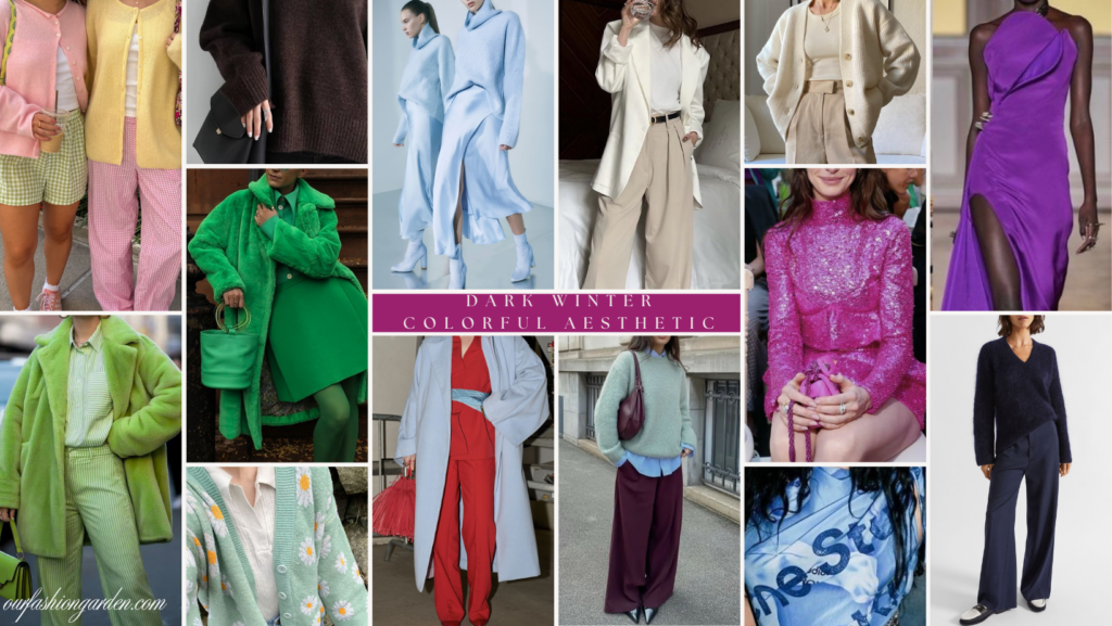
But hey, this palette also has a ton of neutrals that you can use beyond black and white, and it also has some bright and pastel colors that you’re sure to love for your outfits. Dark Winter is often misunderstood as an overly rigid or restrictive palette. And while it does focus on depth and contrast, this palette is actually one of the richest and most flexible in color analysis. This palette allows you to alternate between elegant, bold, cheerful, and even soft looks, it’s all about choosing the right colors.
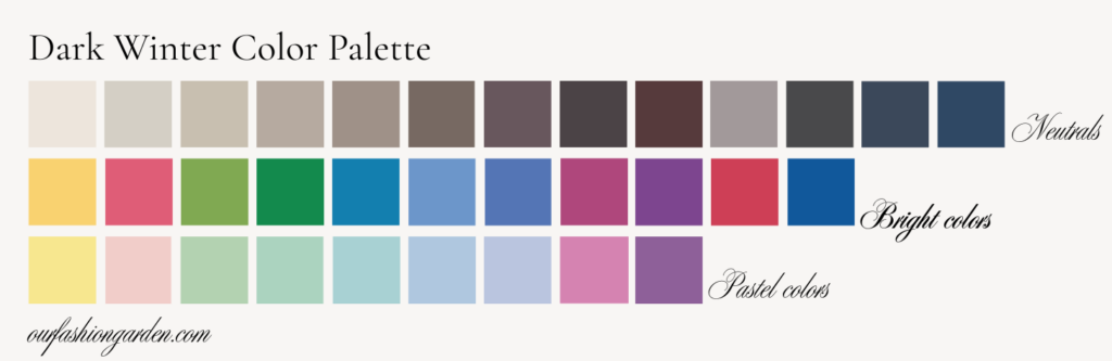
Neutrals:
One of the biggest advantages of Dark Winter is its wide range of cool and deep neutrals, far beyond basic black. So if you couldn’t find those cool brown or beige tones, they do exist!
- Among your main neutrals are cool taupe and stone beige tones, mushroom and greige tones, cool browns and cocoa tones (a favorite for many), charcoal gray, graphite, deep navy, and ink blue.
- These neutrals are incredibly versatile and interchangeable. So you can create monochromatic outfits using different intensities of the same neutral.
- Combine a cool taupe with charcoal gray for a softer alternative to black.
- Use deep navy or blue-gray as your new go-to black for work or everyday wear.
Since all these neutrals share a cool undertone, they blend seamlessly together.
Bright Colors:
If you’re looking to use bright colors, this palette won’t disappoint. Some of the best shades I’ve seen make someone stand out in a dark winter palette are cool fuchsia and raspberry, cool emerald and forest green, cobalt, royal blue, cool red, deep purple, and berry tones.
Many times, it’s scary to try them because they’re saturated colors, and you’re afraid they’ll look “too much.” But believe me, I’ve seen girls in this situation, and once they discover how one of these colors looks on them, they can’t go back.
- These shades work best when combined with intense neutrals, used as statement pieces (coats, pants, dresses, bags), or paired with other bright colors for high-contrast, trendy looks.
Pastel Colors:
Yes, even Dark Winter can wear them. This is where many people are surprised!
- Dark Winter pastels aren’t dusty or dull; they’re icy and fresh. Some good examples are icy yellow, cool blush pink, mint, cool aquamarine, icy sky blue, light lavender, and soft berry.
- These colors are perfect if you’re going for a more cheerful, playful, or romantic look. You can also pair them with darker pieces (pastels with charcoal or navy tones work wonderfully).
With intentional styling, Dark Winter can look fresh, colorful, and cheerful, not just dark or dramatic.
Once you move past the idea that Winter equals only black and jewel tones, you’ll discover a palette that’s modern and surprisingly playful.
True Winter
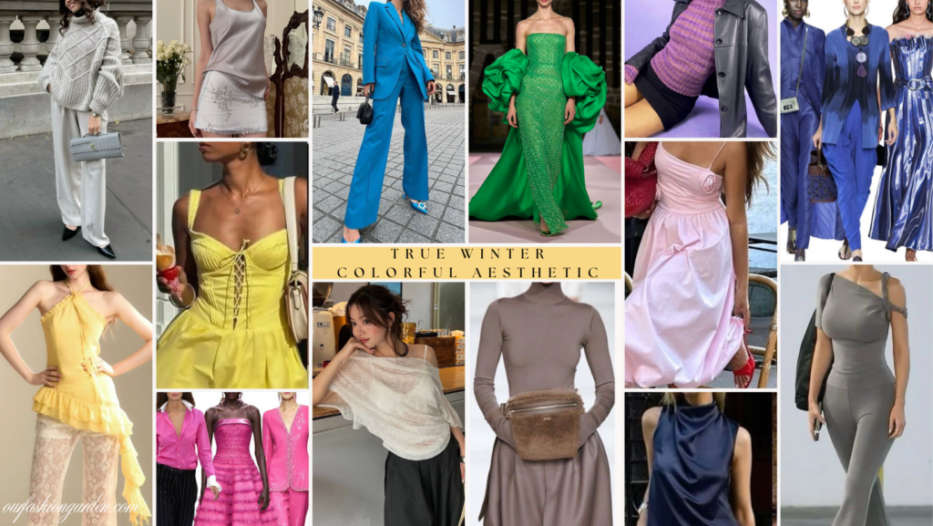
Let’s talk now about the heart of the winter season: True Winter. This subseason is defined by pure, high-contrast colors. For me, True Winter is like sunlight reflecting off freshly fallen snow, cobalt skies in the heart of winter, and gemstones catching the light.
When it comes to dressing more colorfully, True Winter truly shines. Unlike Dark Winter, which is a bit deeper, or Soft seasons with very muted colors, True Winter celebrates color in its purest and most intense form. But even with its intensity, it’s versatile enough for classic, sweet, playful, or dramatic looks, so let’s look at some of the colors that best suit this palette!
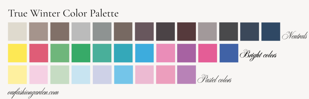
Neutrals:
One of True Winter’s greatest secrets lies in its cool, balanced neutrals, which go far beyond classic black.
- If this is your palette, you have a wide range of light and medium grays (stone, light gray, cool taupe), deep grays, and charcoal. Cool navy, petrol blue, cool browns, and ash (very different from the warm browns of Autumn, but equally elegant).
You can combine them, guaranteeing a classic, elegant, and sophisticated look. Try mixing light gray with navy, cool taupe with charcoal, or medium gray with a bright accent.
Bright Colors:
This is where this palette truly comes to life! If you’re looking for a bright, fun, modern, or energetic style, this is the section of the palette that will work best for you.
- In this range, we include cool yellows, fuchsias, magentas, and intense pinks, emerald greens and vibrant cool greens, as well as turquoises, teals, and electric blues, light and vivid purples, royal blue, and cobalt.
But how do you wear them with confidence? Here are some ideas:
- You can use them as a main color with neutrals (for example, fuchsia + gray), in contrasting combinations (blue + cool yellow), or in clean, defined color blocks.
These colors don’t suit everyone, but if this is your palette, they will make your skin look brighter and neutralize any blemishes or spots.
Pastel Colors:
True Winter can also be cheerful and soft. One of the biggest myths is that Winter can’t wear pastels, but the key is that True Winter pastels are cool and clean, not powdery.
- Some good examples are icy pink, cool lavender, light sky blue, cool mint green, and cool pale yellow. These are ideal colors for a more youthful style or for people with Ingenue essence. Although if you know how to combine them, they can work for any essence, depending on the silhouettes and materials you use them in.
- An excellent way to combine them is with white or light gray. You can also contrast them with a dark accessory or, of course, use them in soft monochromatic looks, which will also look charming.
- If you’re looking for a colorful, youthful, or delicate style, True Winter allows it perfectly, as long as the color maintains clarity.
True Winter isn’t a strict or limited palette. It’s surprisingly light and cheerful!
Bright Winter
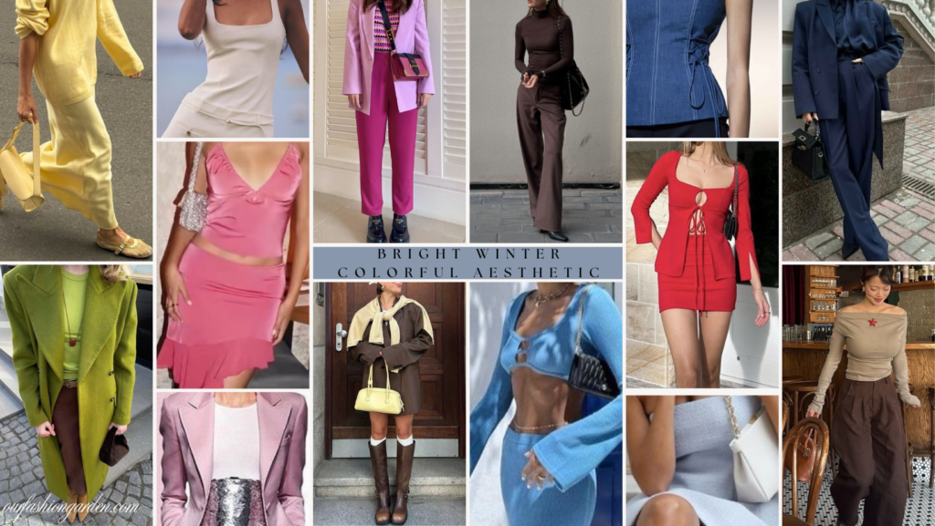
And finally, let’s talk about the Bright Winter palette. Compared to True Winter, these colors are, overall, brighter, warmer, and slightly lighter, but still with more blue than yellow undertones, meaning they’re still more on the cool side.
When I discovered this was my palette, although the colors fascinated me, I was honestly a little scared because I felt like everything was too saturated, and that I was going to look strange. But as I’ve experimented, I realize that the vibrant, cool reds, mint, or even the icy yellow don’t look strange on me at all. That’s the magic of finding your right color palette: you realize that there are certain colors that, even if they weren’t your first choice when choosing clothes, actually look great on you.
So let’s explore this lovely palette a little more:
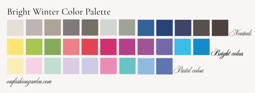
This palette is certainly enhanced by pure black and white, but it’s by no means limited to dark tones; on the contrary, we could say it’s electric, since its dark colors are very dark and its light colors very vibrant, so you can easily go from a dark or sober style to a colorful and fun one.
Neutrals:
The perfect balance for so much color. Contrary to what many believe, Bright Winter does have a solid base of neutrals
- In this palette (in addition to black and white), we find light and medium grays with cool undertones, cool and stone taupes, cool and deep navy blue, as well as steel blue and cool and smoky browns.
- These neutrals serve as a visual anchor for the bright colors; for example, you can combine light gray + fuchsia, cool taupe + lime green, or navy + electric blue.
- These neutrals also allow you to create polished looks without dimming the palette’s energy. They are ideal for everyday or work outfits.
Bright Colors:
This is the soul of Bright Winter; this is where this palette truly shines (metaphorically and literally). Bright Winter’s colors are saturated and vibrant, never muted or powdery.
- Some of the key colors are cool, vibrant yellow, lime green and other intense greens, cool reds and cool coral, powerful fuchsias and magentas, vivid purples, turquoise, cyan, and bright blue.
- What’s special about these colors is that they work incredibly well together. You can combine them in strong contrasts like pink and green, which are complementary (meaning that on a color wheel, they would be directly opposite each other).
- You can also combine them in colorful triads (blue, yellow, and fuchsia) or use them as the absolute focus with minimal neutrals.
Pastel Colors:
Bright Winter can also wear pastels and shades that look delicate and soft, as long as they maintain their cool, light, and clean qualities.
- If you like wearing pastel colors and are a Bright Winter, I suggest trying to create outfits in cool light pink, luminous lavender, cool sky blue, bright mint green, or cool pale yellow.
- And how to combine them? There really are no limits. You can use any neutral or perhaps mix them for a fresh, youthful, and very optimistic look, perfect if you’re looking for a super colorful style without resorting to colors that don’t flatter you.
If you love color, contrast, and energetic looks, here’s a palette that doesn’t limit you.
And what if I’m still not convinced by my winter palette?
If you discovered you’re a Winter and immediately felt resistance, we understand. Winter palettes often have a reputation for being too intense, rigid, or extreme. Let’s address some of the most common concerns about this color season and, more importantly, how to deal with them:
1. “The palette feels too rigid or extreme.”
This is one of the most common reactions, especially when people first see brighter blues, bold pinks, or highly saturated contrasts. Here’s the key: Not every Winter needs to dress in full intensity all the time.
- Winter is about freshness and clarity, not looking neon or theatrical. If very bright colors make you feel like you’re wearing a costume, or if you prefer softer expressions of color, focus on deeper or softer versions of your colors, cool neutrals, and use bright colors only as accents, not as head-to-toe looks. Intensity is a tool, not a requirement.
2. “I want neutrals that aren’t black.”
This frustration is completely valid. Many winters don’t want to live in black, and luckily, they don’t have to. You’ve already discovered that all three seasons have their own beautiful range of neutrals. You can create a neutral wardrobe without black, as long as the undertone remains cool and the colors aren’t too muted or too warm.
3. “I like browns, earth tones, and struggle with pure white.”
Swap pure white for a cool off-white, pearl, or icy light gray. Choose cool browns (espresso, ash brown, cocoa) instead of warm camel. Winter doesn’t mean “no browns.”
4. I’m a Winter, but I don’t like my color palette.”
This is very, very common. If you don’t like your colors, remember that following color theory isn’t a rule, but a guide, and you can always wear the color you want if you feel good in it. If you want to wear, for example, a spring or autumn color, I suggest you alternate it with a color that is within your palette or that your makeup is Winter-toned, so that the warm color doesn’t work against you.

Color analysis isn’t meant to strip you of your identity or your personal taste. If you feel pigeonholed, the problem is usually not the palette itself, but the limited interpretation of it, or treating the palette as rules instead of resources. Also, remember that considering your style essence, lifestyle, and personality also plays a huge role in this.
Once you understand how to adjust the intensity, choose the right neutrals, and respect your personal style preferences, winter becomes one of the most versatile and expressive color palettes available.
If you’ve ever felt disconnected from your winter palette, it doesn’t mean you’re wrong;
it just means you haven’t yet been shown how to make it your own.
So, if you already know you’re a winter, but most of the inspiration you find seems too dark, too severe, or just doesn’t suit you… You’re not doing anything wrong. Winter palettes are often presented in their most extreme versions, and that can make it difficult to see all the creative possibilities they truly offer.
If you’re drawn to a colorful, vibrant, or expressive style, your winter palette can be the perfect complement. The key is not to limit yourself to the most stereotypical version of your palette.
Your winter colors can become your best ally, helping you create vibrant outfits!
Explore our style analysis services to discover your essence and seasonal palette in detail, or find curated pieces for your exact colors at Handpicked Attire.


Leave a Reply