
Spring is the season of renewal when the natural world is painted in vibrant, blooming colors. As a result, the elements of Spring are warm, bright, and luminous, giving an overall bright and fresh appearance.
We’ve already discussed our relationship with nature, and just like the seasons, every one of us has unique natural features. For example, if you’re spring, you have a soft and delicate appearance, and your skin is usually sensitive, especially on the face. The undertone of spring types tends to be golden, favoring warm, bright tones.
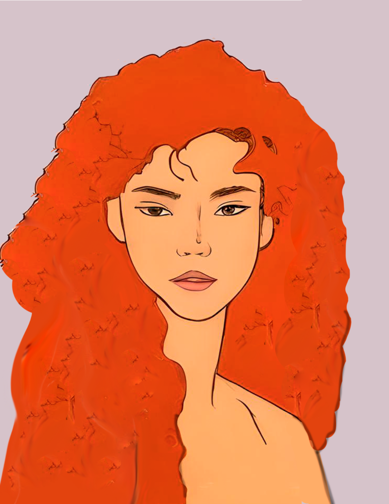
All of these features are unique to spring people. However, within this group, there are three subcategories to learn more about your season:
- True Spring
- Bright Spring
- Light Spring
Each of them has distinct characteristics that should assist you in determining which colors work best for you and how to build combinations that look amazing on you!
Don’t worry too much if some features of your appearance don’t match the following descriptions 100%. You might still fall into this season of colors even if there are a couple of characteristics that you don’t identify with.
True Spring
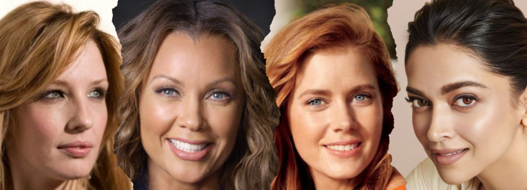
True spring is bright and warm. Although the colors appear intense in the palette, they add a new dimension to True Spring’s clean appearance. Its opposite season is True Autumn. And in contrast to the latter, True Spring’s appearance is bright and fresh rather than earthy and dull.
Characteristics of a True Spring
Is your general appearance warm and bright? There is no cold quality to your appearance, golden and honey tones dominate your features. Then you are a real spring.
Plus, your skin, eyes, and hair look fresh and clear. Instead of blending, they contrast each other; there is nothing muddy or gray about them. In general, the contrast between their features is medium.
eyes
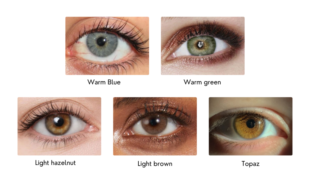
True spring eyes are usually full of light and warmth:
- Warm blue
- Warm green
- Light hazelnut
- Light brown
- Topaz
And while the contrast between the skin and hair, they are not as bright and vibrant as Bright Spring’s eyes. You may also notice a sunburst pattern around the pupil, which is characteristic of spring eyes.
skin
True Spring skin is characterized by warm, golden undertones. That means that while gold makes the skin look healthy, silver looks very unharmonious against it.
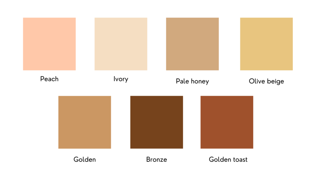
Common skin tones:
- Peach
- Ivory
- Pale honey
- Olive Beige
- Golden
- Bronze
- Golden toast
The warm spring skin tone is filled with a wide range of shades ranging from warm light to tan, with the usual presence of brown freckles like the rest of spring.
hair
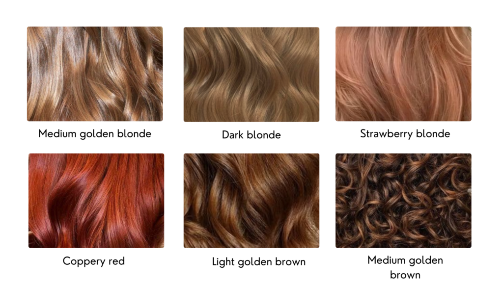
The main hair shades of this season are:
- medium golden blonde
- dark blonde
- strawberry blonde
- coppery red
- light golden brown
- medium golden brown
This sub-season’s splendor is warm colors with a golden undertone. Some persons born in this season are blonde at birth but turn brunette as they age. Their colors contain red tones as well.
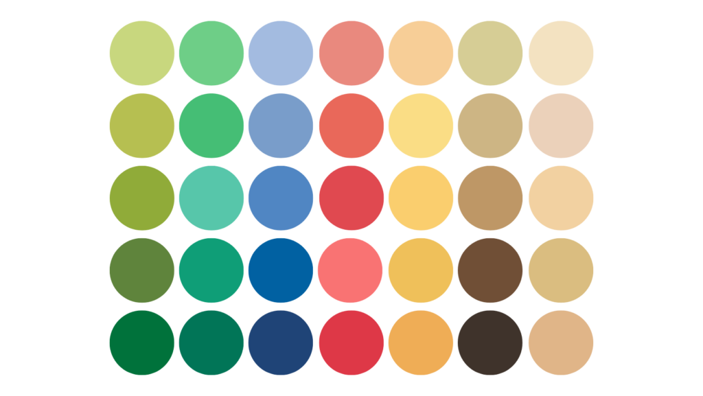
color palette for warm or true spring
True Spring is the colorful season of sunshine, lush green leaves, and juicy fruit. The hues are warm and fresh, reflecting the warmth of the spring sun. The palette contains the saturated colors of spring flowers, freshly grown grass, and green leaves. True Spring is spring at its peak.
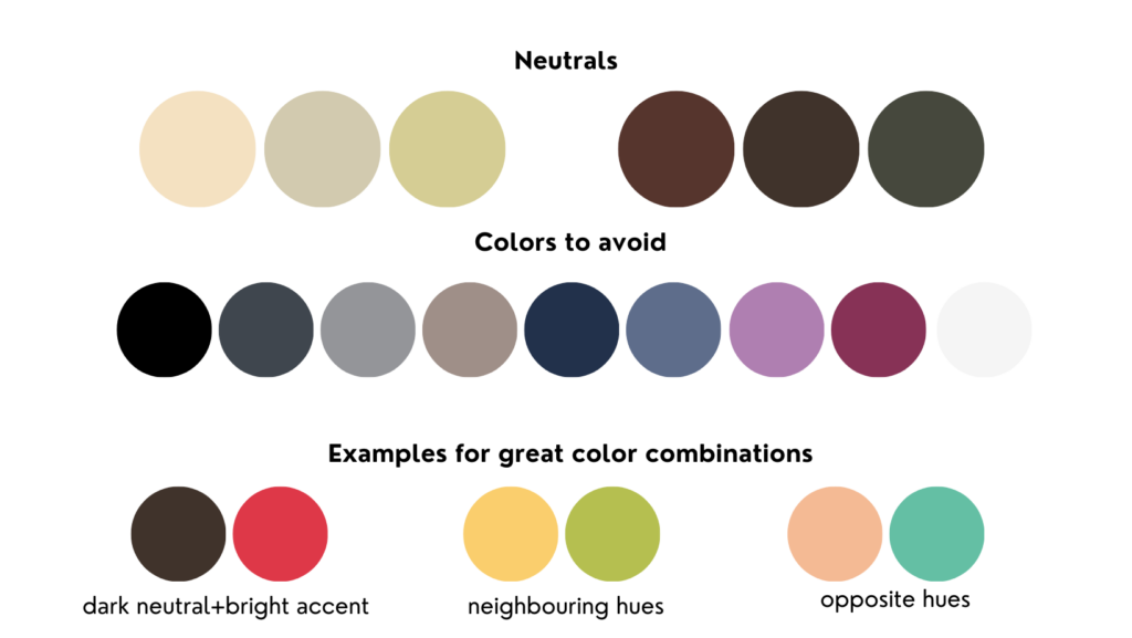
- True black and white (two winter colors) are not in the True Spring color palette as they are too cold and harsh. To replace black, you have warm chocolate browns and greenish grays, which you can use as dark neutrals.
- For light neutrals, you have light yellows and greens instead of whites. They are warmer and softer than pure white. Browns and even beiges (if they’re bright enough) are the best True Spring neutrals.
- Very cool, dull, toned-down colors, such as icy blues and dusty grays, will clash with your natural warmth and make you look unhealthy. Deep blues and purples will also make you look out of place.
Technically, you can combine any of the colors in the True Spring palette with each other. But certain combinations will look much better than others. Those are the combinations that repeat the level of contrast that is naturally present in your appearance.
Combine dyes with shades of the same color, such as light green with dark green. And add any type of contrast, you can combine colors that are far from each other on the color wheel, like peachy orange and teal. The further apart the colors are the greater the contrast between them.
You can also mix neutrals with bold accent colors. If you choose a dark neutral, go with a lighter accent; a lighter neutral goes well with a darker accent. Try to include at least one bright hue in your clothing. Using only neutral colors and monotone styles would appear uninteresting.
The best colors for Bright Spring are:
- Red, orange, or pink — warm red, orange-red, orange, melon, salmon, coral, apricot, pumpkin
- Yellow or green — butter, honey, daffodil, spring, mint green, lime green
- Purple or blue — orchid, lilac, rhubarb, sky blue, tiffany, turquoise
These are just guidelines to get you started. You don’t want to restrict yourself too much if the colors below aren’t appealing but instead allow it to be a guide and play around with different shades in each category until you find what works best.
Bright Spring
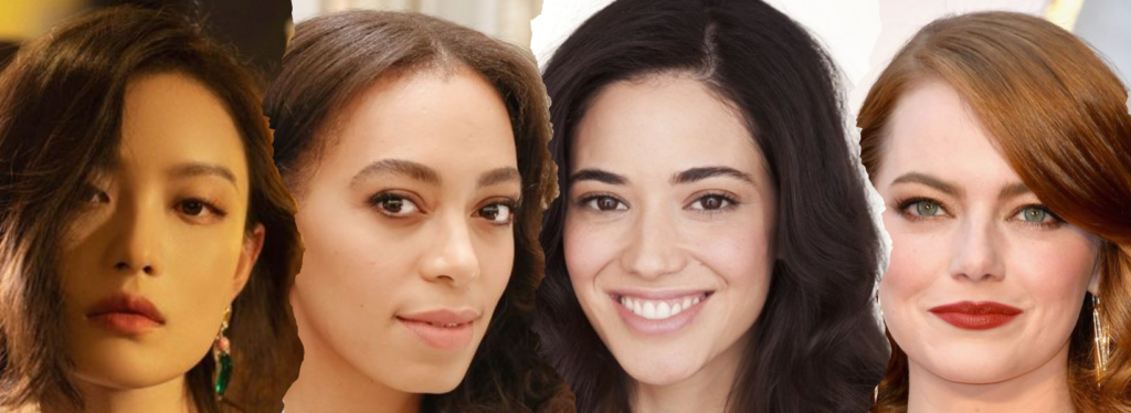
Bright Spring is bright and warm. Like nature’s most saturated colors, the bright spring palette will take you on a journey full of vibrant colors, from the sky to the sea.
If you find most of these colors in your natural features, this is the season for you!
Characteristics of a Bright Spring
You’re a Bright Spring if your overall look is bright and your secondary look is warm, meaning gold flatters your skin more than silver.
Your color is very saturated and your appearance is vibrant and bright. There is also a very high contrast between your skin, eyes, and hair. Your eyes will probably be clear and perhaps bright.
eyes
Bright Spring’s eyes are generally light. Due to the high contrast with the white of the eye, they appear bright and clear, as if they were translucent. They may be:
- Blue
- Green
- Topaz
- Brown as long as they are bright
They have warm undertones and you may notice a sunburst pattern on the iris, which is typical of spring eyes.
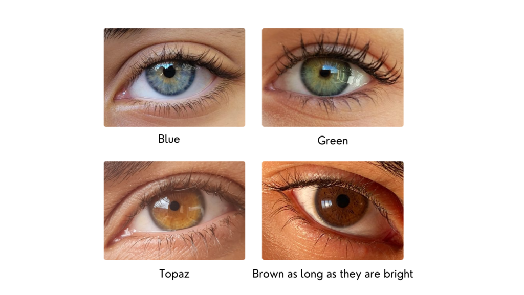
eyes
Bright Spring skin comes in a wide range of shades, it is fresh, clear, radiant, and luminous, it has neutral or warm undertones, which means that both gold and silver look good in contrast, but gold looks better.
Common skin tones:
- Porcelain
- Light peach
- Classic ivory
- Suede beige
- Bronze
- Deeper brown
- Black Brown
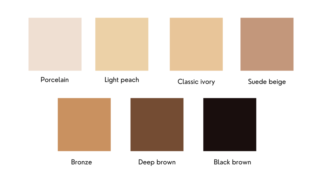
hair
The hair is usually warm and tends to develop golden blonde highlights when exposed to the sun.
Common hair colors:
- medium golden blonde
- dark golden blonde
- copper
- reddish brown
- medium brown
- dark brown
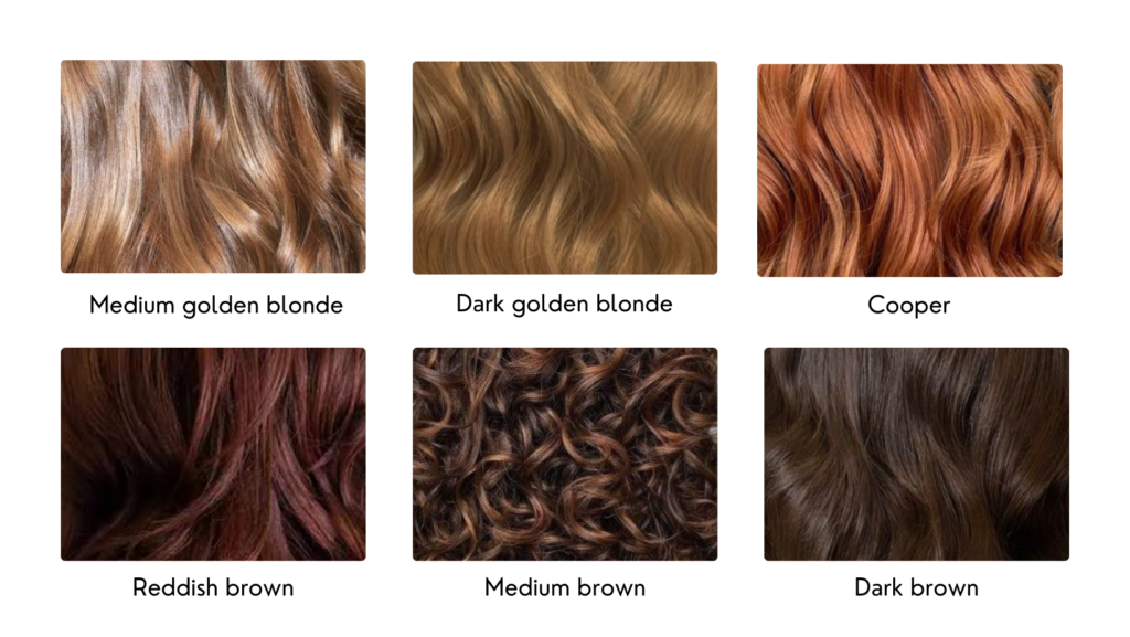
Color Palette for Bright Spring
This palette has the most saturated, vibrant, and vivid colors of the twelve seasons. It is the sister season of Bright Winter so it also has some of the sharp and stark contrast of winter.
- Since Bright Spring flows from winter, black is included in the palette. But the best versions of black for Bright Spring are a slightly yellowish charcoal and a slightly greenish black. These are warmer and more suitable dark neutrals than the cold blue-black of winter.
- Additionally, black alone is not enough for a bright spring, as you need vibrant colors to enhance your look. It is best mixed with some of the other warmer, more saturated colors in the palette. There are also darker grayish browns and warm blues that you can also use as dark neutrals.
- A soft white, a more yellowish off-white, and soft greens act as light neutrals. They are a little warmer than the cold, harsh whites of winter.
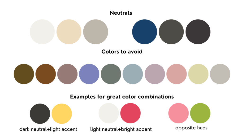
Since the main color aspects of Bright Spring are brightness and warmth, the worst colors are dull and cold. Desaturated and muted colors, such as dusty blues and muddy browns, will dull your natural glow and make you look cloudy.
Technically, you can combine any of the colors in the Bright Spring palette with each other. But certain combinations will look much better than others. Those are the combinations that repeat the level of contrast that is naturally present in your appearance.
Don’t be afraid to combine different colors, especially those that are opposite each other on the color wheel, like pink and green. The more unusual the combination, the more striking.
Another way to create high contrast is by pairing a neutral color with a bright accent color. Pair a dark neutral with a lighter, brighter accent color or a light neutral and a different darker accent color.
In general, always look for at least one bright color in your outfit. Avoid exclusively neutral combinations, monochromatic looks, and low-contrast combinations. These will diminish its naturally vibrant coloring.
The best colors for a bright spring are:
- Red, orange, or pink: chili, true red, coral, orange, salmon, bubblegum, sunset, grapefruit
- Yellow or green: butter, honey, banana, sunshine, lemon, sunflower, shamrock, jade, lime
- Purple or blue: purple, heliotrope, rhubarb, azure, blue, sapphire, turquoise
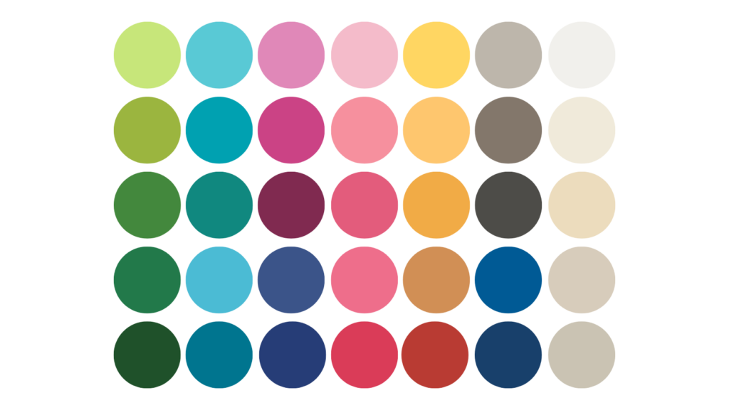
Light Spring
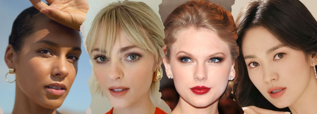
Spring is fragile but vivid, light, and warm. It reminds us of the first brilliant hours of spring when the sun is ready to rise, its gentle rays beaming on the most delicate petals of the flowers.
Characteristics of a Light Spring
You are a light spring if your overall appearance is light and warm, meaning warm colors suit you better than colder ones.
There is very little contrast between your skin, eyes, and hair. All your features are equally light. If your complexion is dark, but you have a very light hair color for your ethnicity, you may be a Light Spring.
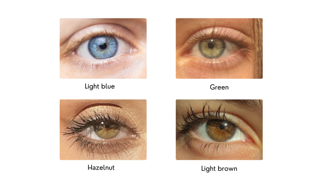
eyes
Light Spring’s eyes are of course light:
- Light Blue
- Green
- Hazelnut
- Light brown
Like all spring eyes, they are bright and have warm undertones. You may also notice the typical spring sunburst pattern on the iris.
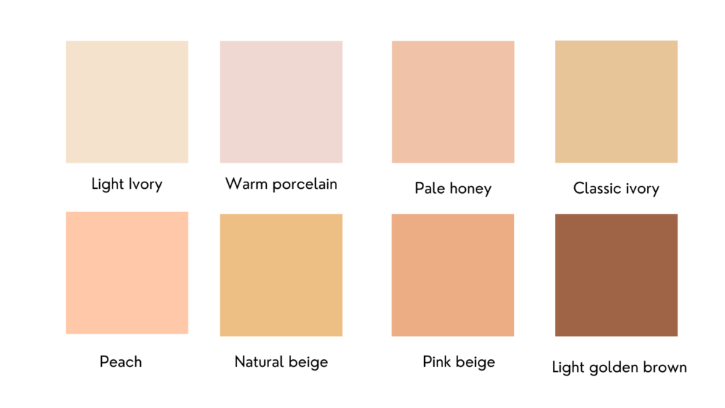
skin
Light Spring skin is neutral or has warm, neutral undertones, which means that both gold and silver look good in contrast, but gold looks better. Light Springs can also have freckles.
Common Skin Tones:
- Light Ivory
- Warm Porcelain
- Pale Honey
- Classic Ivory
- Peach
- Natural Beige
- Pink Beige
- Light Golden Brown
Spring fair skin still possesses spring’s peach and gold-tone tone and warm characteristics. However, it deviates from deep tones, making the usual skin color range from light to medium.
hair
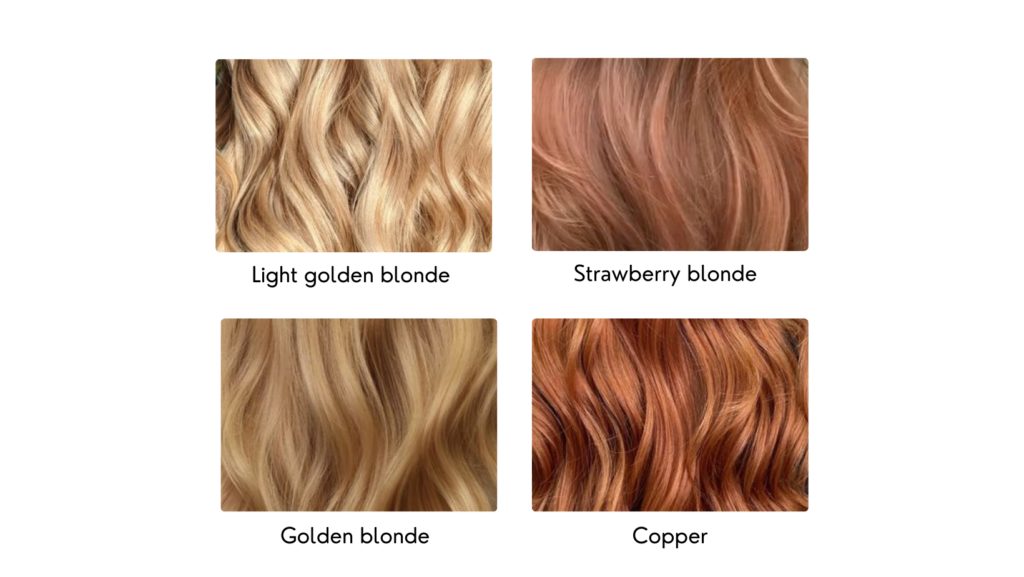
This subseason’s hair is naturally light. Common hair colors:
- Light golden blonde
- Strawberry blonde
- Golden blond
- Copper
Brown or red is also possible, but whatever the shade of those mentioned, a light spring hair color still has the distinctive warmth of the season and the innate golden hue or shine. Most of Light Springs were also blonde when they were children.
Color Palette for Light Spring
These are the days when the warm sun brings out the last flowers of spring and the first hint of summer is in the air. The colors are warm and cool but still light and soft. While this season has the characteristic freshness of all spring seasons, it also has some of the softness of summer.
This palette is quite bright and colorful. Includes warm, medium-saturated, low-contrast colors, such as pinks and grass greens.
- True black is cold and dark in contrast to your warm and bright appearance. Instead, you have plenty of other relatively darker neutrals, like slightly greenish grays and medium-dark browns. The color closest to black in the palette is a warm, medium-dark gray.
- And instead of true white, which is also too cold and harsh for your appearance, you have soft yellowish, pinkish-white, and light greenish grays.
- Overly bright and saturated colors, such as burnt orange, will overwhelm your delicate appearance and make you disappear behind them.
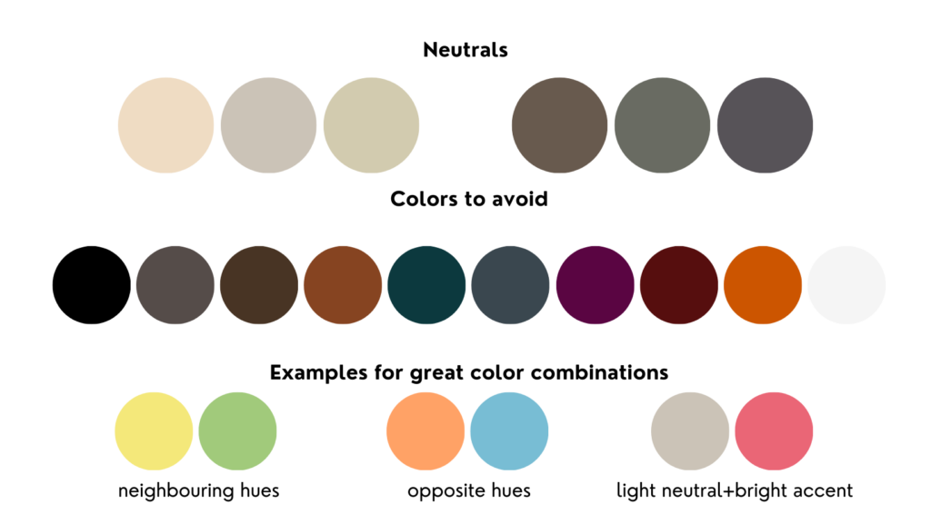
Technically, you can combine any of the colors in the Light Spring palette with each other. But certain combinations will look much better than others. Those are the combinations that repeat the level of contrast that is naturally present in your appearance.
Of the three spring seasons, this one has the lowest contrast and the most delicate appearance. It needs vibrant, contrasting, fun color combinations to come to life.
You can combine neighboring tones, such as yellow and green. You can also combine colors that are far apart on the color wheel, such as orange and blue. The further apart the colors are the greater the contrast between them.
You can also combine neutral colors with brighter accent colors. If you choose a dark neutral, select a lighter accent; while a lighter neutral pairs better with a slightly darker accent.
In general, always look for at least one bright color in your outfit for a colorful look. Avoid exclusively neutral combinations and monochromatic styles, as they will seem boring.
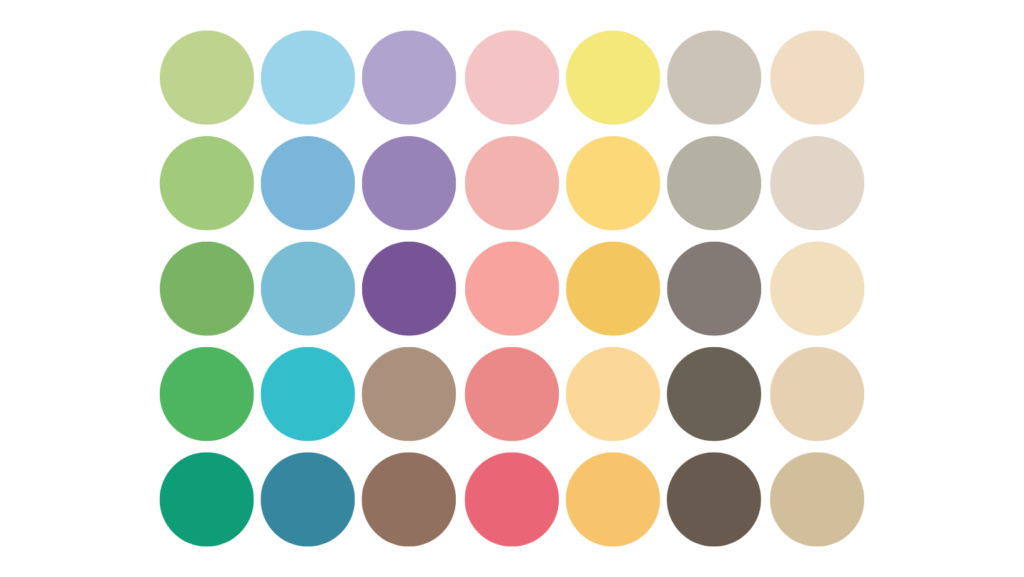
Some of the best colors for you are found under these base colors:
- Red, orange, or pink: soft red, light red, orange-red, apricot, melon, watermelon, caramel and grapefruit.
- Yellow or green: chiffon, banana, honey, daffodil, calendula, pistachio, lime and mint.
- Purple or blue: aquamarine, light mauve, lavender, pale blue
FINALLY, A COUPLE OF EXTRA TIPS:
Use your colors as a guide, not a rule
You shouldn’t rely on your colors as an infallible rule for every color that suits you. So why not?
Since the 12 seasonal subtypes are neither exclusive nor exhaustive. That means you might not fit perfectly into a single type or color palette. It would be a shame to ignore all the other colors if your characteristics match one of the types.
Other palettes, particularly those in your season, offer a wide variety of other shades to experiment with that will also suit you. Using the other palettes can assist you in creating more diverse but still cohesive color schemes for your needs. Start with your recommended color palette and work your way up to experimenting with different color tones and shades.
prioritize colors close to your face
Color analysis seeks to find colors that complement your skin tone, hair color, and eye color—in other words, your face. Colors that are not close to your face can influence your overall appearance but not necessarily your complexion.
Try wearing different colored clothes close to your face. If you have a favorite color that isn’t in your palette, go ahead and use it; however, try to use it for details or in a lower part of your outfit, away from your face.
Your personal preferences always win over color analysis
Your color palette should never limit your ability to express yourself.
If the suggested colors do not match your style concept, simply examine each shade individually to see if you can pull it off. Using the process of elimination, you can begin to create a color palette that is uniquely yours. If a particular shade makes you look sickly, look for a substitute that captures the essence of the color but matches your skin tone better.
i hope this helps you better understand those colors that go perfectly with you, so you can create perfect looks for yourself.
If you are not sure which station is yours, you can consult what is my seasonal color palette – the only quiz you need or request our personalized advisory services


Leave a Reply